

Good transactional emails are key to many businesses, making the difference between confused customers and happy ones.
But what are transactional emails anyway?
You certainly had experience with them - those are the order confirmations that actually tell you when your package arrives, the password reset that works on your phone, the receipt you can find later. What makes all these emails work is that they're clear, they load fast on mobile, and they give you exactly what you need.
Most people copy templates for transactional emails without understanding why they work. But you really need to understand the patterns first to make it work. Only then you can create emails that actually fit your business.
This guide breaks down real transactional email examples and shows you what makes them tick. You'll see order confirmations, password resets, receipts, and more. Plus you'll learn how to build your own.
TL;DR: Transactional Email Examples
The most important transactional emails:
- Order confirmations: Show order details, payment info, tracking links
- Password resets: Include secure tokens, clear instructions, security warnings
- Welcome emails: Confirm signup, set expectations, show next steps
- Receipts: Provide complete details, clean layout, PDF attachments
- Shipping notifications: Give tracking info, delivery dates, action links
What makes them work:
- Clear content that tells users what to do next
- Mobile-friendly design (most people read email on phones)
- Your brand colors and fonts throughout
- Fast delivery (within seconds of the trigger)
- Clean, professional layouts
What to watch out for: Don't just copy templates blindly. Study why they work, then adapt them to your brand. Focus on making emails clear, mobile-friendly, and useful.
What Makes Effective Transactional Emails?
The best transactional emails share a few key traits. First, they're crystal clear: when someone opens your order confirmation, they should instantly see their order number, what they bought, and when it arrives. No hunting around.
Second, they work on phones. Over 60% of emails get opened on mobile devices now. If your email breaks on a phone screen, you've lost your customer. Single-column layouts, big buttons, readable fonts - simple stuff that works.
Third, they arrive fast. When someone resets their password, they want that email now, not in 10 minutes. Speed builds trust, delays create support tickets.
Fourth, they give users something to do. Every transactional email needs a clear next step - track your package, reset your password, download your receipt.
Finally, they match your brand: your transactional emails shouldn't look like they came from a different company. Same colors, same fonts, same feel. Customers notice when things look off.
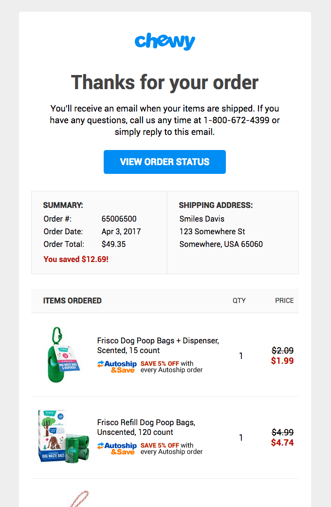
Order Confirmation Email Examples

Order confirmations are probably the most (and fastest) opened transactional emails. People want details of their orders, such as if their order went through and when stuff arrives. People often don't trust web interfaces so will go to their inbox for proof.
A good order confirmation starts with the order number right at the top, big and bold. Then it should show what they bought in a clean table format with product names, quantities, prices.
Next come payment details. Show the payment method (last 4 digits of the card is enough), the total amount, and any tax or shipping charges. Shipping information goes below that. Include the shipping address so they can double-check it's right. Remember to also add the estimated delivery date. If you have a tracking number already, include it with a big "Track Package" button.
IMPORTANT NOTE: Some brands EXCLUDE shipping information as a best practice to ensure that no PII ever leaks. You'll see large companies like Amazon, Walmart, etc do this. Customers can misspell their domain (gail instead of gmail) and that information can end up in the wrong hands.
The best order confirmations also include helpful links such as those that help customers view the order online, start a return or contact support. Put these in buttons, not just buried in text.
Like Uber, you can also include a main CTA to get value from the product you just charged them to help reduce churn.
Subject line tip: Keep it simple. Something like "Order #12345 confirmed" or "Uber Subcription Renewed" works better than clever copy. People search their email for order numbers later.
Password Reset Email Examples

Password reset emails need to do two things: be secure and be fast. People locked out of their accounts don't have patience for confusion.
Start with a security warning right at the top. "If you didn't request this password reset, you can ignore this email." This prevents panic if someone gets the email by mistake.
Then get straight to the point: "Click the button below to reset your password." No long explanations needed. Put a big, obvious "Reset Password" button right there. Make it a button, not a text link especially as buttons work better on mobile.
You should always include an expiration time with lines such as "This link expires in 15 minutes" or "This link expires in 1 hour." Put this near the button so people see it. Nothing worse than clicking an expired link.
Add the reset link as plain text too, below the button. Some email clients block buttons, and people might need to copy-paste the link.
Subject line should be clear: "Reset your password for [Your App Name]". Skip the fancy stuff. Someone trying to get back into their account wants clarity, not creativity.
We also recommend including one or two interesting pieces of information in the email you're sending so that the user knows you are reaching out to them and they aren't subject to a phishing attempt. We've seen brands like LinkedIn do this often in their footers.

Welcome Email Examples

Welcome emails set the tone for your whole relationship. Get it right and you've got an engaged user; mess it up and they might never come back.
Start with a warm greeting using their name if you have it. "Welcome to [Product], Sarah!" feels better than generic greetings. Then confirm what just happened: "Thanks for signing up."
You should set expectations early. Tell them what kinds of emails you'll send and how often. Weekly newsletters? Product updates? Special offers? Be honest. If they know what's coming, they're less likely to unsubscribe later.
Show them one clear next step. Not five things, not ten features, but only one thing. Maybe it's completing their profile, maybe it's browsing products, maybe it's reading your most popular content - pick the action that creates the most value fastest.
If your product has key features or benefits, highlight 2-3 of them, possibly with images or icons if they help. But don't overwhelm readers and save the full tour for later emails.
Finally, put some helpful links such as FAQ, support and quick start guide. Put these in the footer where they're available, but not distracting.
Subject line: "Welcome to [Product]!" still works best. People expect it and look for it.
Also, don't feel the need to go crazy with the content. You can keep it simple, like the team at Turbopuffer do:

Receipt Email Examples
Receipts are boring but important. People need them for expense reports, taxes, and records. Therefore, you want to make them easy to find and use.
Put the receipt number and date right at the top. Use a clear format like "Receipt #R-2024-12345" and "December 15, 2024" that will help with searching later.
Show what they paid for in a clean table that includes item names, quantities, individual prices, subtotal, tax and total. Include also full payment details which means payment method, last 4 digits if it's a card, transaction ID and payment date. These are important as some companies need this for accounting. Use the same format every time as consistency matters for financial documents.
Always offer a PDF version. You can either attach it to the email or include a download link. PDFs are easier to save and forward than HTML emails and many accounting systems prefer them.
At the end, add your business details too such as company name, address and tax ID if applicable. This stuff matters for business customers claiming expenses.
Subject line should be searchable: "Receipt for order #12345" or "Your receipt from [Company] - December 15". People search for receipts months later.
Shipping Notification Email Examples

Shipping notifications might be the most anticipated transactional emails as people want to know their stuff is on the way.
Lead with the good news: "Your order has been shipped!" and then immediately show the tracking number and carrier. Make the tracking number big and easy to copy, or better yet, make it a link that goes straight to the carrier's tracking page.
Next should be the estimated delivery date prominently. "Expected delivery: Tuesday, December 17" is what people care about most. If you have a delivery window ("between 2-6 PM"), include that too.
Confirm the shipping address - this prevents panic when someone suddenly wonders if they used the right address. Show it clearly but don't make it the focus.
It’s always good to include a brief reminder of what's coming. You don't need full order details (they have the confirmation for that), but "Your order of 2 items" or listing the main products helps people know which order shipped.
The focus should be a big "Track Package" button. Make this the primary action since it is something people will click on multiple times before delivery.
Subject line: "Your order #12345 has shipped" or "Your [Product Name] is on the way". Both work, but including the order number helps with multiple orders.
Transactional Email Design Patterns
Good design isn't only about looking pretty, it's first and foremost about making emails that work. Here are the patterns that matter.
First, create a visual hierarchy. The most important stuff should be at the top. As we mentioned in the examples, these are things such as order number, tracking number and password reset button. Whatever the email is about goes first, big and bold, while less important stuff goes below, smaller and lighter.
Make content scannable keeping in mind people don't read emails word by word but skim through it, looking for what they need. Use short paragraphs (2-3 sentences max) and add spacing between these sections. Bullet points when listing things are very useful tool, and you should also bold important words like dates, amounts, and action items.
Buttons need to be obvious and tappable. Use contrasting colors that stand out and write clear button text: "Track Package" beats "Click Here" every time. On mobile, they will be minimum 44 pixels tall and you should test your buttons on an actual phone.
Keep your branding consistent, but subtle. Your logo at the top, your colors in the buttons and links - but don't go overboard. Transactional emails are about function, not marketing.
We mentioned that today over 60% of email opens happen on phones, which is essentially to design emails with mobile interface in mind. Use a single column layout, make text at least 14 pixels, put important info in the first 320 pixels (what shows in preview), make buttons big enoch and test everything on a real phone, not just your desktop browser's mobile view!
Where Bento Fits: Transactional Email Templates
If you're building transactional emails, Bento gives you templates that actually work, plus the infrastructure to get them delivered.
You get pre-built templates for all the standard transactional emails: order confirmations, password resets, shipping notifications, receipts. They're already mobile-optimized and tested across email clients, you can just add your content and brand colors.
The templates are flexible, which means you can change colors, fonts, and layouts to match your brand and you can add custom fields for your specific data. You're not stuck with generic designs, but can use these templates as a basic start for designing your transactional emails.
Here's the real value: deliverability infrastructure comes built in. Authentication setup (SPF, DKIM, DMARC), reputation monitoring, send rate controls. This stuff usually costs extra or requires separate tools, but with Bento it's just included.
Therefore, Bento makes sense when you want professional transactional emails without building everything from scratch - you get templates, customization, and deliverability in one package.
If you use some specialized tools, they still have their place. If you need pixel-perfect email design control, use a dedicated design platform or iIf you want deep analytics on every email element, specialized analytics tools do that better. But Bento gives you what you need to start and, most importantly, keeps your emails out of spam folders.
Ready to Build Better Transactional Emails?
Now you've seen what works. Time to build your own!
Start by auditing your current transactional emails. Which ones confuse customers? Which ones generate support tickets? Fix those first. A clear order confirmation saves more support time than any fancy automation.
Pick one email type to improve. Maybe password resets if you get lots of "can't log in" tickets or maybe shipping notifications if customers keep asking where their orders are. Start with the email that causes the most problems.
Then this guide comes to play - use the patterns we have listed here! Make sure you go though all the important points: clear hierarchy, mobile-first design, obvious buttons, fast delivery and testing.
Once you send your transactional emails into the wild, measure what matters. Open rates for transactional emails should be around 80%+. Click rates vary by email type, and password resets should see 40%+ clicks. If your numbers are way off, something's broken. Make sure also to watch support tickets for confusion patterns as small improvements add up.
Good transactional emails reduce support tickets, increase customer satisfaction, and build trust. Start with one email. Make it better. Then move to the next.

