Copywriting should be short, simple, and precise. Piece of cake, you may think. Only, it’s one of the hardest things to get right in email marketing and marketing in general.
How come?
First, you need to sound original. Second, you mustn’t bore your readers. Third, you need to have a story. A story gives character to your brand. Whether it’s big or small, it doesn’t matter; you need to have one.
In this article, you’ll find examples from 7 different e-commerce and email marketing campaigns that will hopefully help you develop an attractive copy all your own.
TLDR: Copywriting helps you build a story for your brand and develop your brand’s character. Take a look at ASOS, a successful clothing brand that has managed to build its brand as an edgy, adventurous, and open-minded clothing company through the use of excellent copy. Or Substack, a writing platform that helps you earn money from followers. Their email copy is great for businesses that want to learn how to introduce new clients to their services without overwhelming them. Copywriting is only one side of the coin when it comes to a good ad campaign - the other is the visuals. In that regard, in my third example IKEA, you’ll find that some ad copy just needs some great visuals. The fourth is about a chocholate company who really knows how to tell an engaging company story with striking design. The fifth example is from Asics, a renowned sports company that tells their almost 80-years old existence on the market by providing info on all their years of work. The sixth and seventh examples concern Illy and Bialleti, two Italian companies that make moka pots and coffee products, respectively. They utilize the power of the visual with a straightforward origin approach.
1. ASOS
 Source: asos.com
Stories are integral to the human experience - they are how we add meaning and depth to our lives. A good story to build your brand on can make all the difference when people are looking for someone to buy from. It also creates a strong base from which your business can continue to grow.
ASOS is a fantastic example of using a story to build a brand.
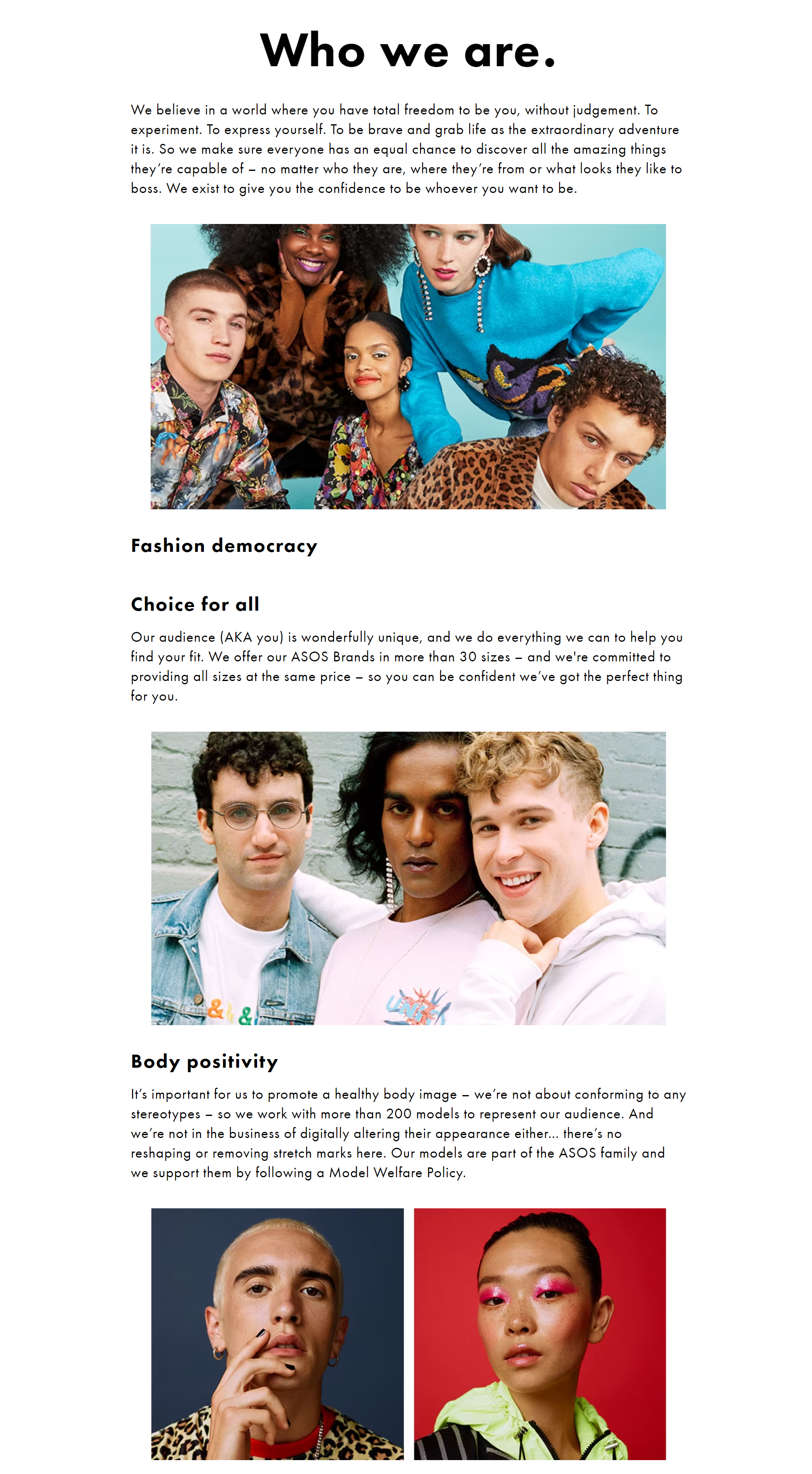
Take a look at their “Who we are” page. You can see that the team at ASOS starts with a general statement on what they stand for and how they want to be perceived by their customers:
“We believe in a world where you have total freedom to be you, without judgment. To experiment. To express yourself. To be brave and grab life as the extraordinary adventure it is. So we make sure everyone has an equal chance to discover all the amazing things they’re capable of – no matter who they are, where they’re from, or what looks they like to boss. We exist to give you the confidence to be whoever you want to be.”
As you can see, they use words and phrases like “total freedom”, “without judgment”, “experiment”, “expressing oneself’, “being brave”, “life as an adventure”, and “confidence”, which builds up their edgy and youthful brand image.
After this, there are several sections like “Fashion democracy”, “Choice for all”, and “Body positivity”, which serve to awaken the sense of uniqueness in all of their customers, regardless of gender, sexuality, race, or body type. This copy’s goal is to make you see them as a clothing brand that allows you to express yourself as the unique individual you are.
2. Substack
Okay, let’s cross over to email marketing territory now. The following example is from Substack, an online platform that allows writers and podcasters to publish content on their site and earn money through subscriptions.
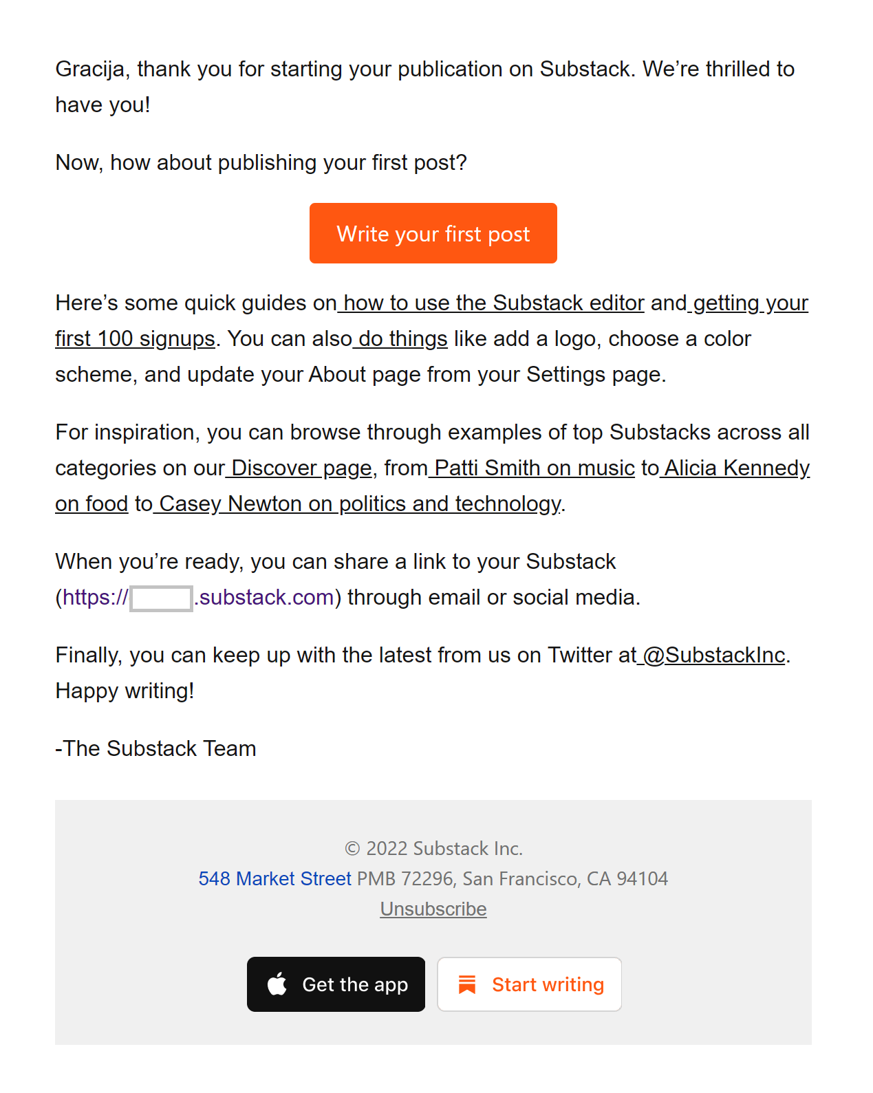 This is an email you get once you sign up and create your own Substack URL.
This is an excellent example of what a welcome email from a service-providing online tool should be. It’s short, informative, and friendly.
When you sign up for a new service, especially one you don’t know how to use, you don’t want to get flooded with so much information that you quit.
Substack knows this, so they only use a nice CTA button and a couple of links on how to get started. At the end of the email, they also provide you with a couple of Substacks that they think might interest you and can serve as inspiration.
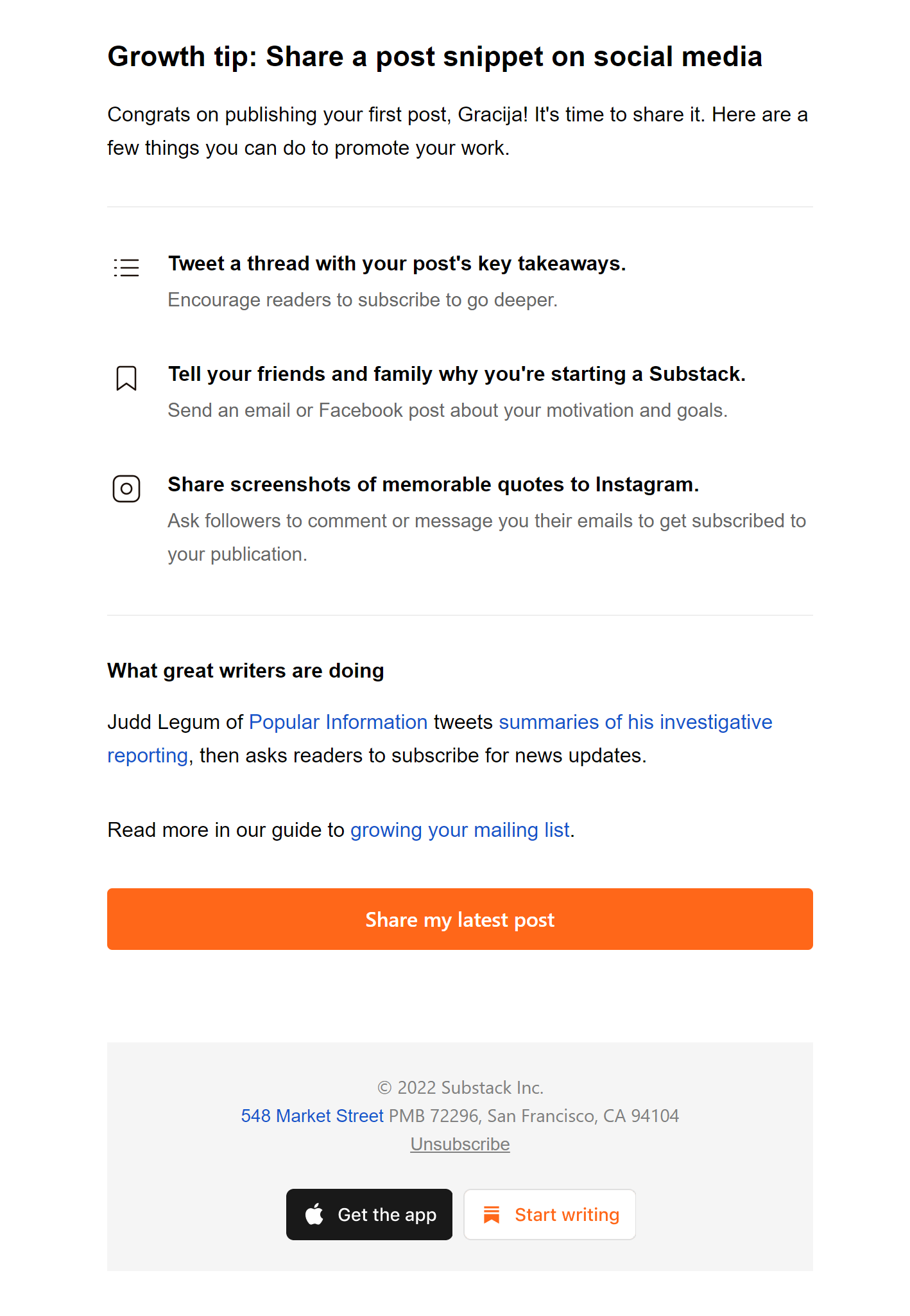 Their follow-up email after your first post contains a couple of straightforward but practical growth tips so you don’t get overwhelmed with the huge and sometimes painstaking task of acquiring followers. You’re just reminded that applying a few simple tips can make a big difference.
In the end, they once again provide you with a successful example, a writer uses one simple act to acquire subscribers. And last but not least is a link to a longer guide on how to grow your mailing list.
Again - simple copy, but informative. It’s not unnecessarily flashy, and it’s not overwhelming. It’s just right for beginners.
3. IKEA
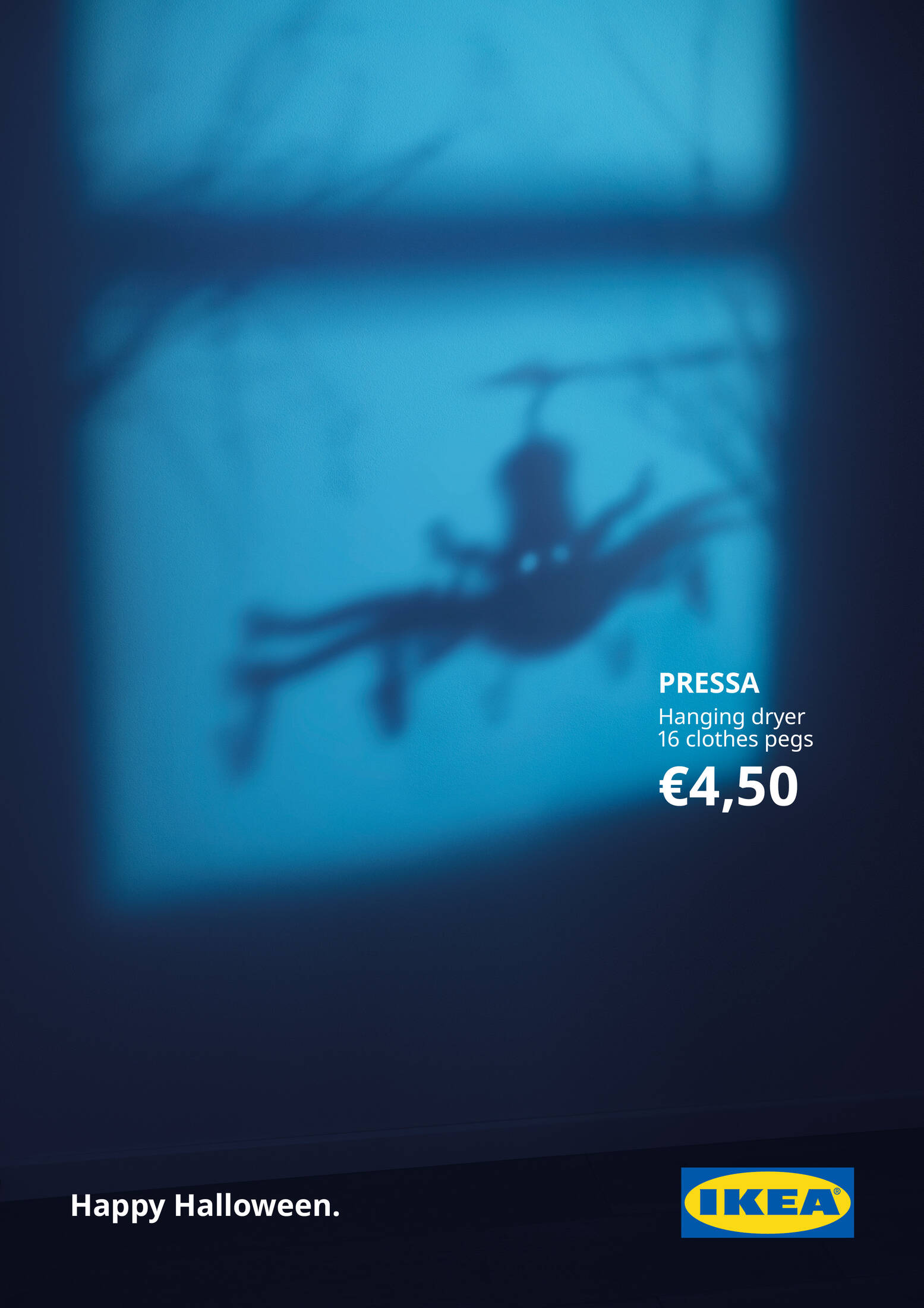
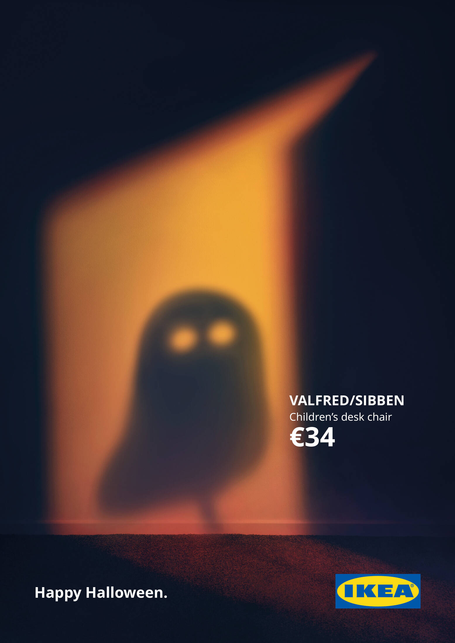 Source: adsoftheworld.com
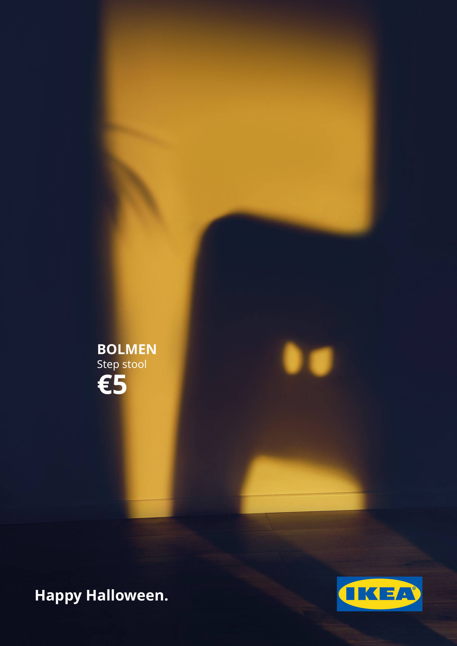
This is an IKEA campaign made for Halloween 2020 by an Italian ad agency.
Have you ever heard of the phrase less is more? This ad campaign is a perfect example of it.
You may wonder, at first glance, why I have included this here in copywriting examples. But hear me out.
Sometimes the best way to advertise is to combine short and sweet copy with striking visuals. This IKEA ad campaign is a perfect example of how you can make that happen.
What do I love the most about this campaign? It is creative, spooky, and perfectly captures the spirit of Halloween all while reminding you that your favorite products from IKEA are available at an affordable price.
By tapping into your inner child and letting your imagination take hold you can create a stirring campaign with pretty much no copy at all. The key to a great ad isn’t always about more unless you are counting the “thousand words” the photos are worth.
By invoking a fun holiday, for both kids and adults, that you don’t usually connect with companies like IKEA, you create a strong memory in the viewer and keep your brand fresh.
4. Tony’s Chocolonely
Tony’s Chocolonely is a Dutch company that produces chocolate. The whole idea behind the brand is that they’re fighting modern slavery which is very prevalent in the cocoa industry.
They’re very serious about what they’re doing that they even imprinted their cause in the very form of the chocolate bar, which is divided into uneven chunks to symbolize the uneven treatment and exploitation of cocoa workers. They even share their story and cause on the inside of the chocolate wrapper (you can see that below). A genius stroke of marketing, advocacy, and activism, if you ask me.
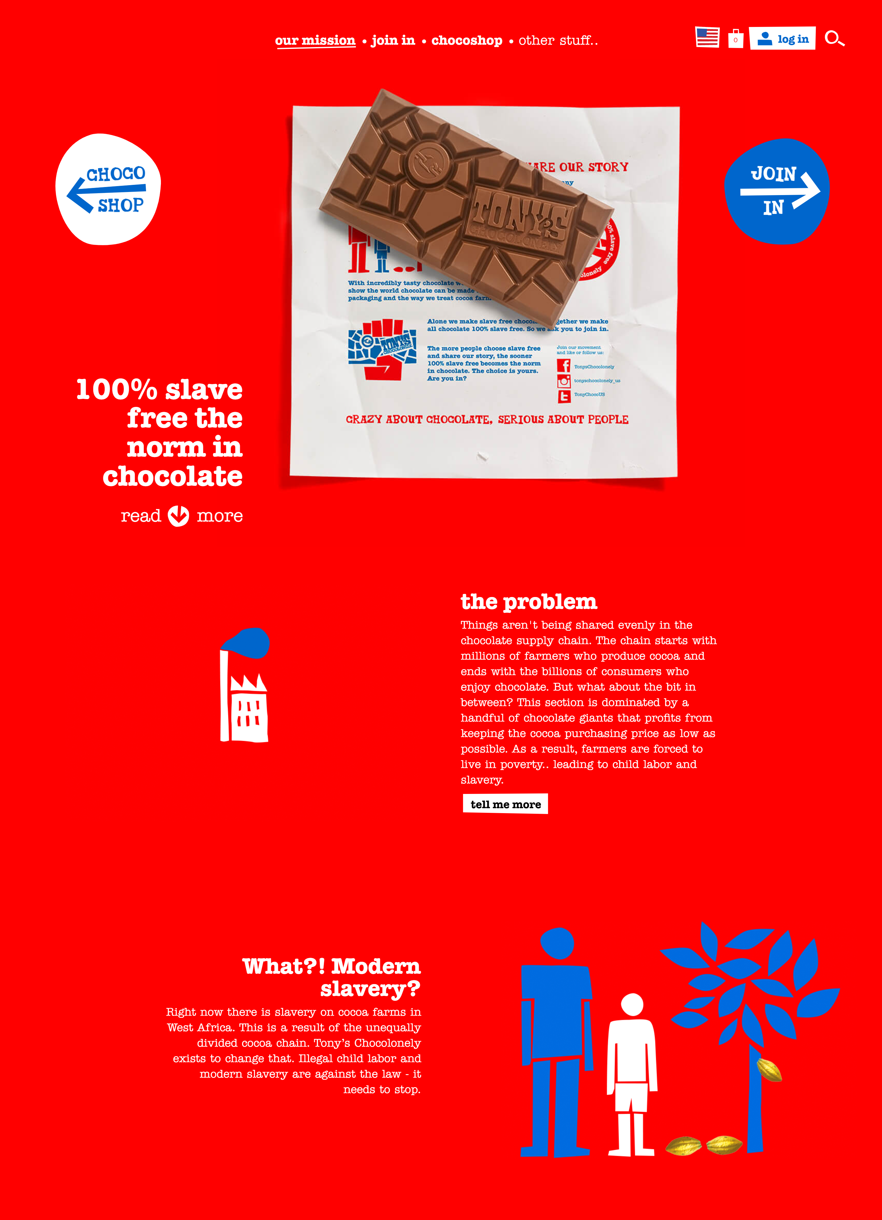 Here, I’m focusing on how this company shares its story on its website. First of all, notice the bold colors. Red is the signature color of Tony’s Chocolonely brand and they’re not afraid to use it in their Our Mission section.
Notice how the narrative flows from top to bottom. Here is an image of the whole page:
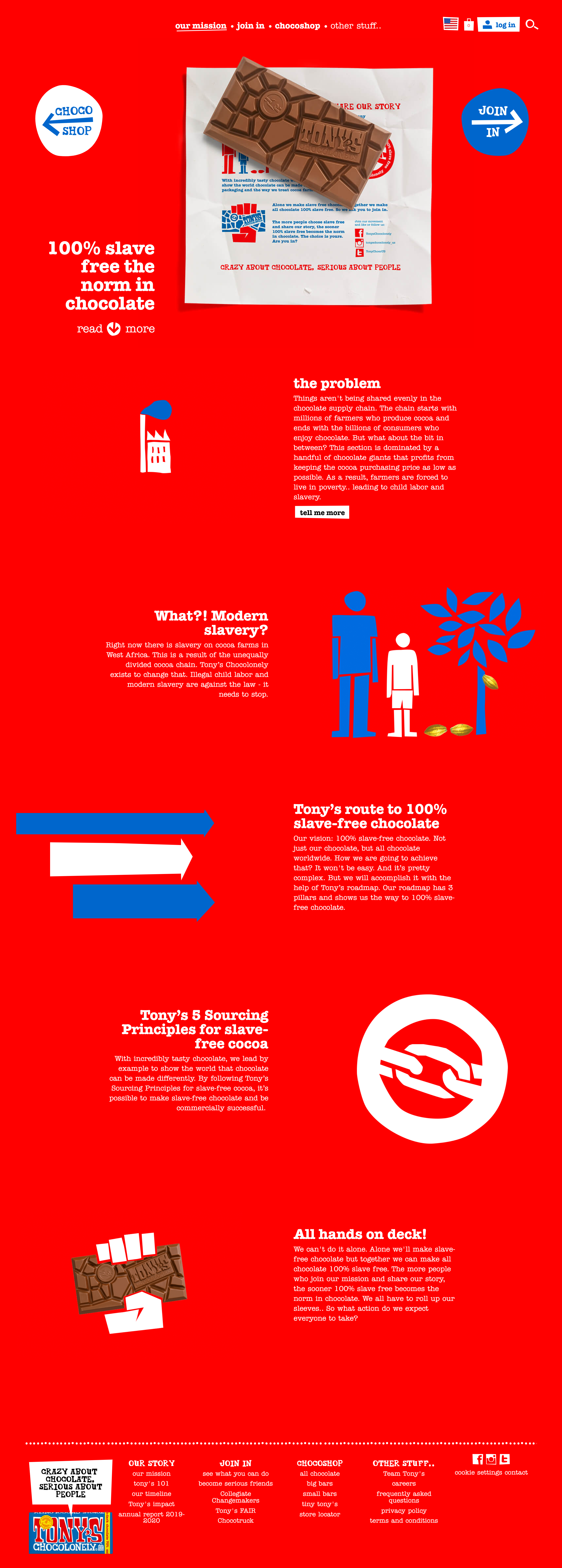 Everything works so well that I could even put it as a poster in my office. The text, combined with the bold color, is evenly positioned left and right in a zig-zag manner, which makes it more enticing and fun to read for a very serious topic. The illustrations and overall visuals are also doing a great job complimenting the text, adding gravity, and calling attention to Tony’s Chocolonely’s mission.
5. Asics
Asics is a legendary Japanese sports shoes and clothing company that’s been active in producing elite-level sporting shoes and clothes for nearly 80 years now. A combination of superb technology, quality, and marketing genius has made them last that long on the market, and stand shoulder-to-shoulder with their competitors, such as Nike, Adidas, New Balance, and others.
Now, when you have a company with such a history, naturally, you’d want to utilize that in the present as well.
Let’s take a look at Asics’ Our Story section. It’s a brilliant copywriting example of how to tell your company and innovations history in one take.
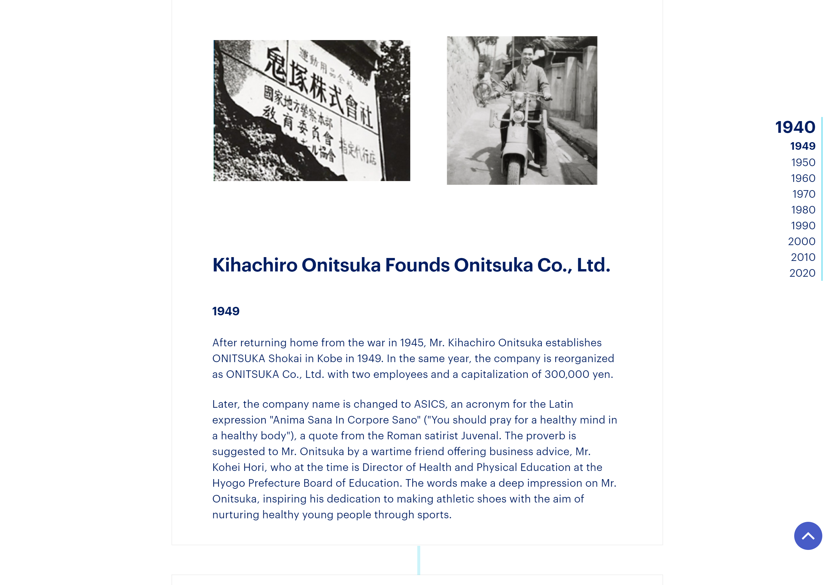 As you can see, on the right side, there is a bar that states all the decades Asics has existed on the market, starting from 1949, when it was founded. In this screenshot, you can see the origin story alongside images of the founder. When you press on each decade on the right sidebar, you’ll get a sub-bar that states all the years within that decade in which Asics was active in producing something new and groundbreaking, accompanied by a short text on the matter.
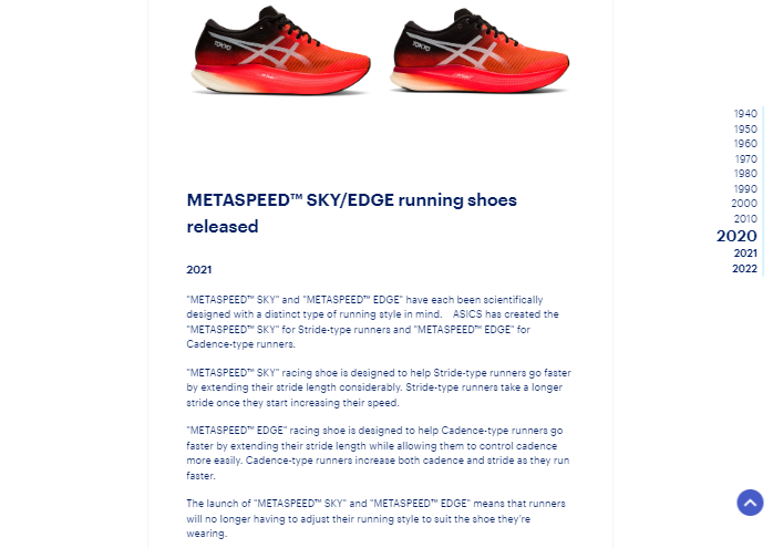
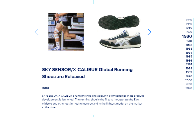 And all of this continues to the present year, 2022, and, presumably, they’ll keep updating it as the years go by.
I love this copywriting example because it’s in a way an encyclopedia of the development of a very important brand in the sports equipment world. It’s a very serious, informative, and fun approach to the history behind a beloved and hugely successful company.
6. Illy
Since I really loved the Asics’ kind of origin story copywriting, I’ll give you another example of a very famous and successful brand, this time in the coffee industry - Illy.
Illy was founded in 1933, so you can imagine how much there is to say in terms of the development of the brand.
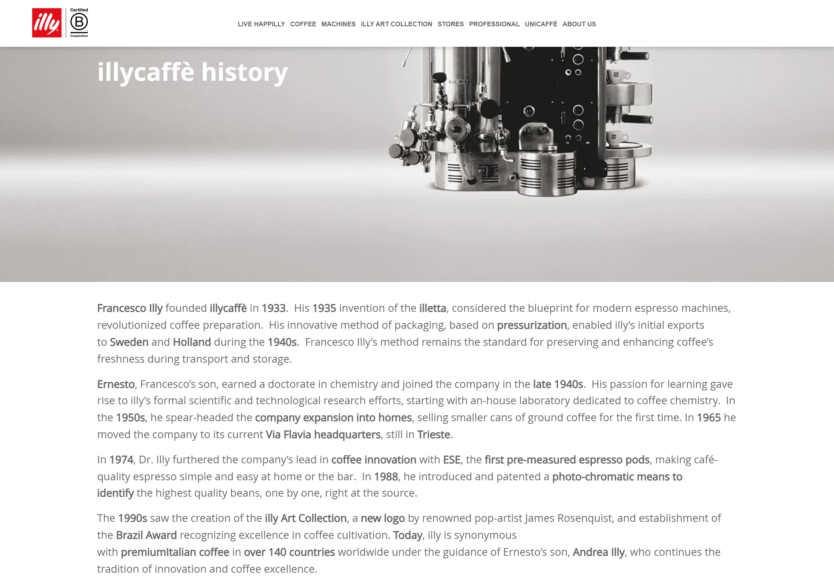 This is a classic, pretty straightforward copywriting noting the history of the company. It’s like reading a Wikipedia text, which is nice because it gives you all the basic data you need to know about it.
And after that comes a mosaic-like part that perfectly combines visuals - images, with text, and overall page design and text/image placement.
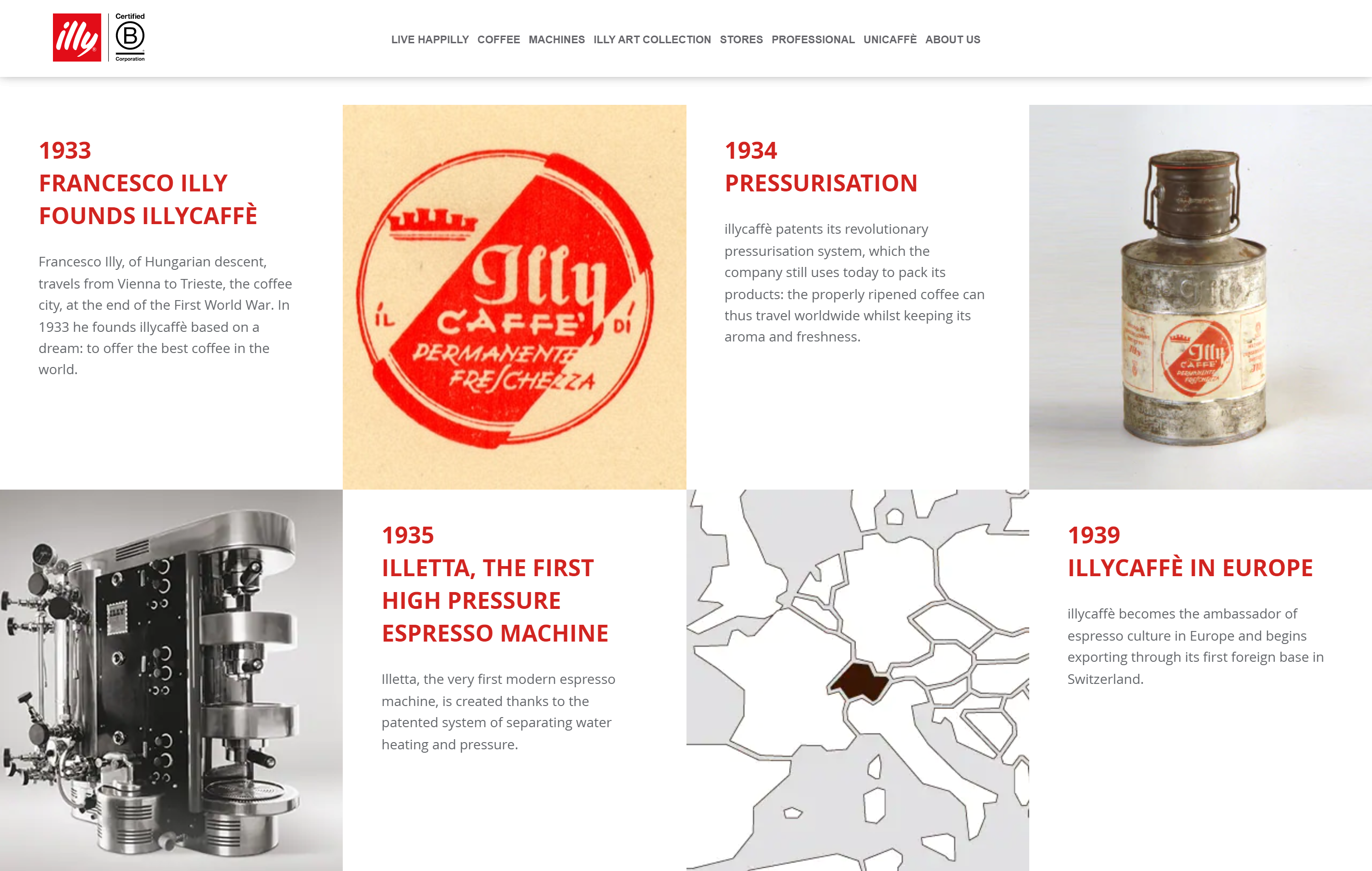 So, you have the history of the brand and its achievements, but in a much more playful way combined with historical photographs. The information is short, concise, and easy to remember - you get the gist of the historical facts, the real important data. The color of the titles corresponds with the overall brand color, which is red, but also in combination with metallic-grey shades, which is its other dominant color.
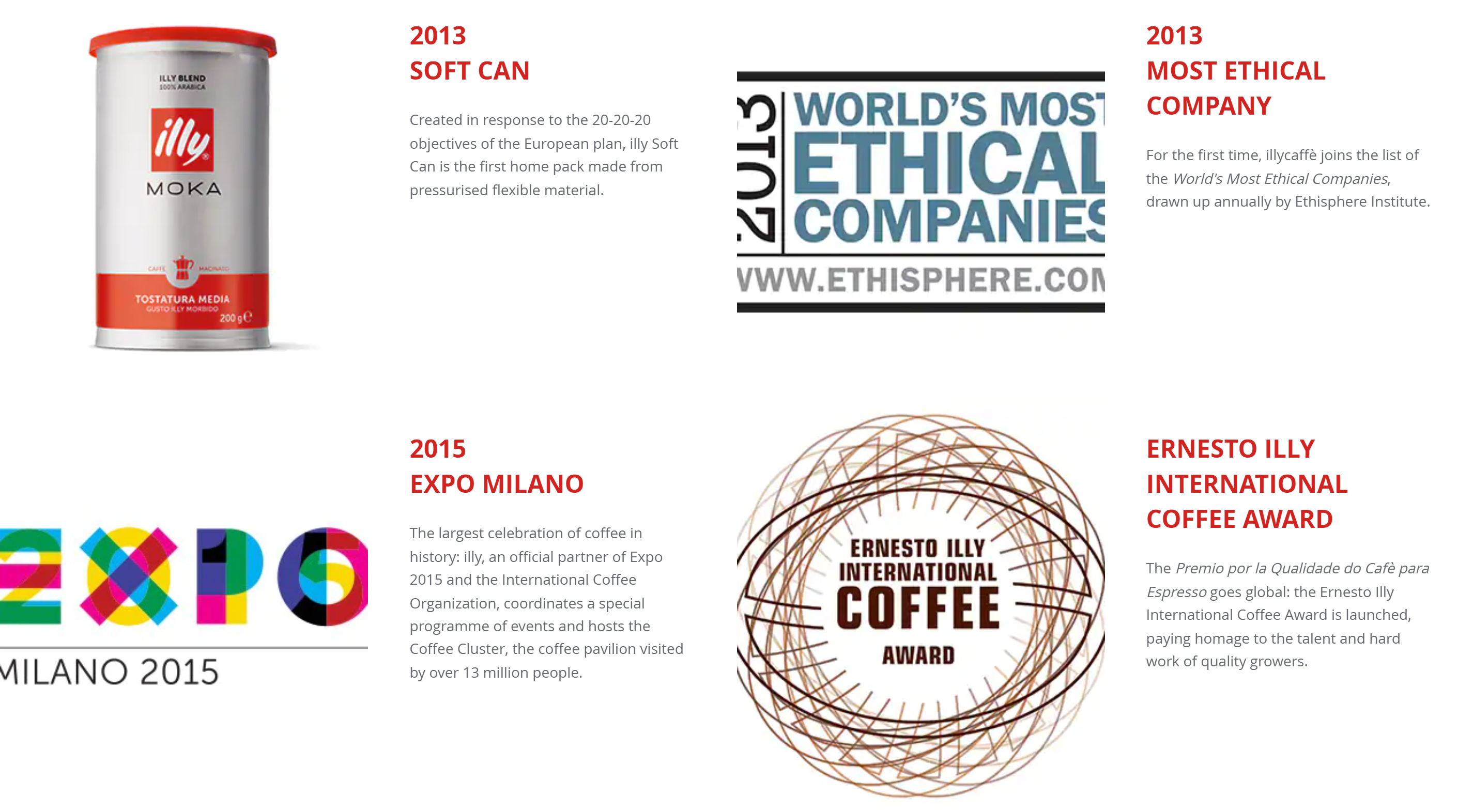 Basically, what Illy does perfectly is combine visual design with textual placement and content. There’s a lot to learn from here.
7. Bialetti
Bialetti is a world-famous brand for coffee machines and accessories. Its most popular product is the Moka pot, a simple espresso cooker that has been around for almost a century now.
Much like Asics, Bialetti has a long history and lots to brag about. On their Moka express site, they trace the invention of the cooker, but the page holds much more than that.
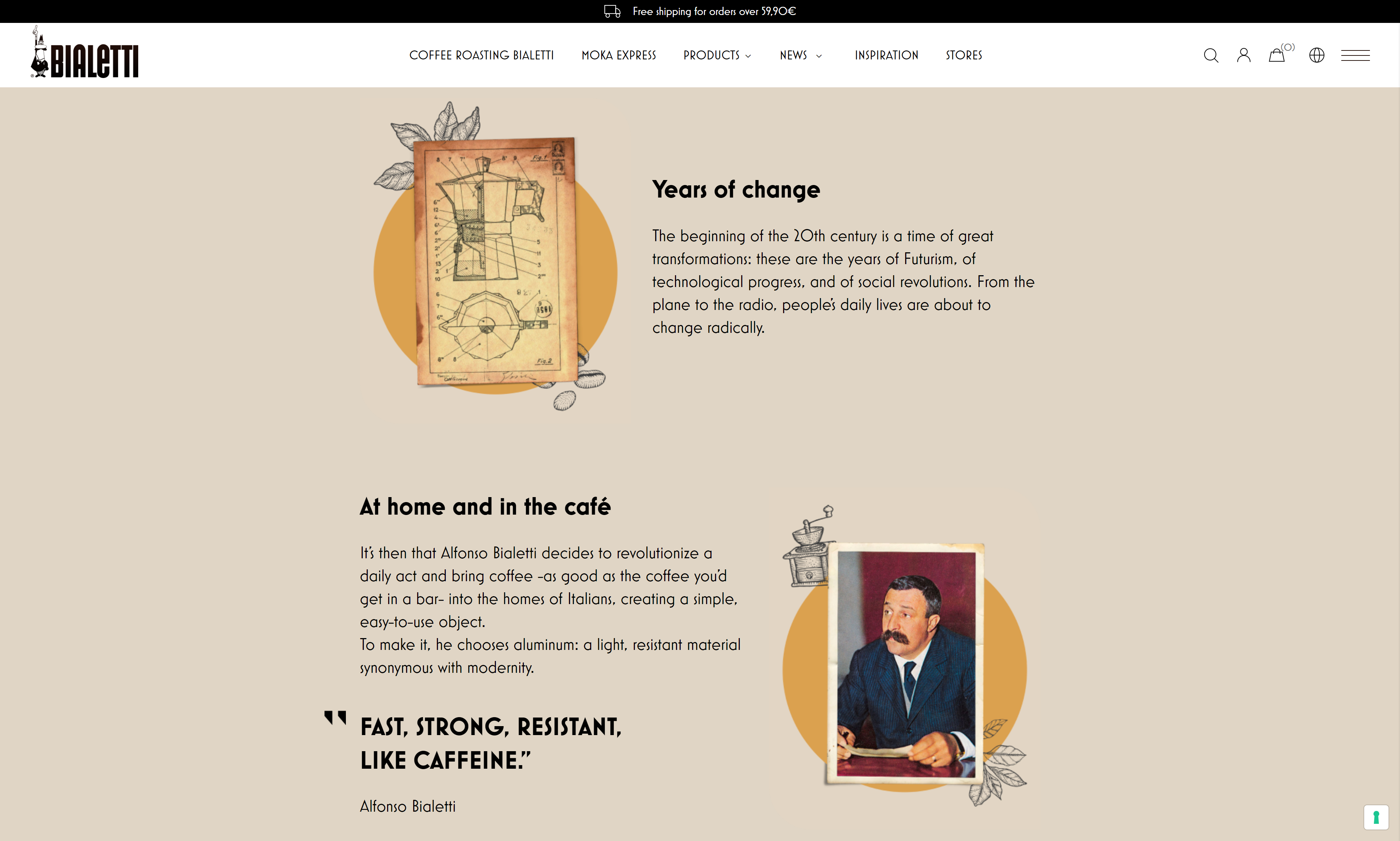 This page has everything, in fact. From the history of the pot, customer testimonials, and quotes, to a how-to image + words guide and a video that explains how best to use the Moca pot.
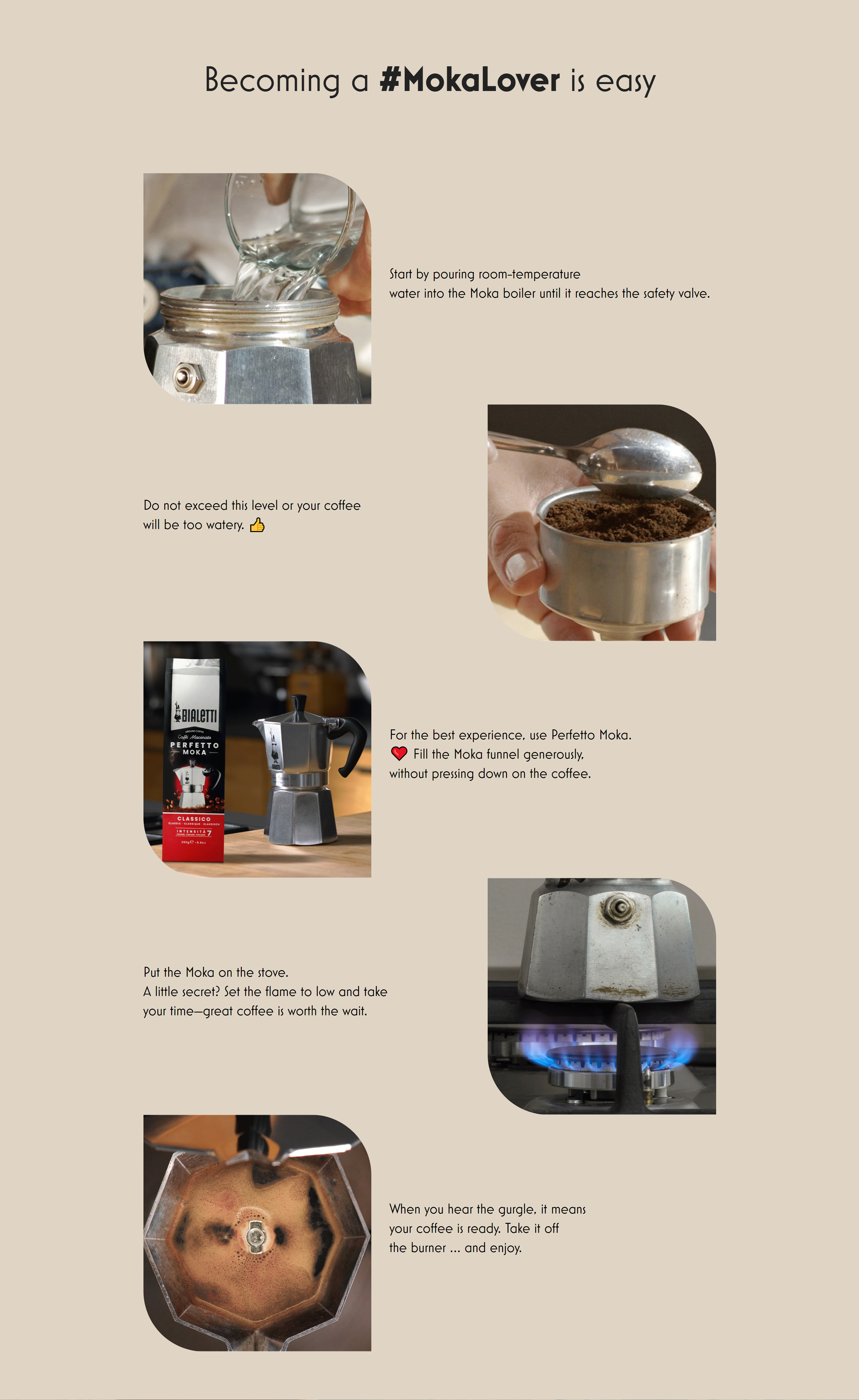 The whole charm of Bialetti’s Moka pot is that it’s easy to use and that it instantly connects you to the beauties and taste of Italy. So, why not use that in copywriting as well?
Besides telling you how easy it is to use this in a couple of steps - alongside images that further spur your desire to make some coffee right now - there are also the comments of real Italians.
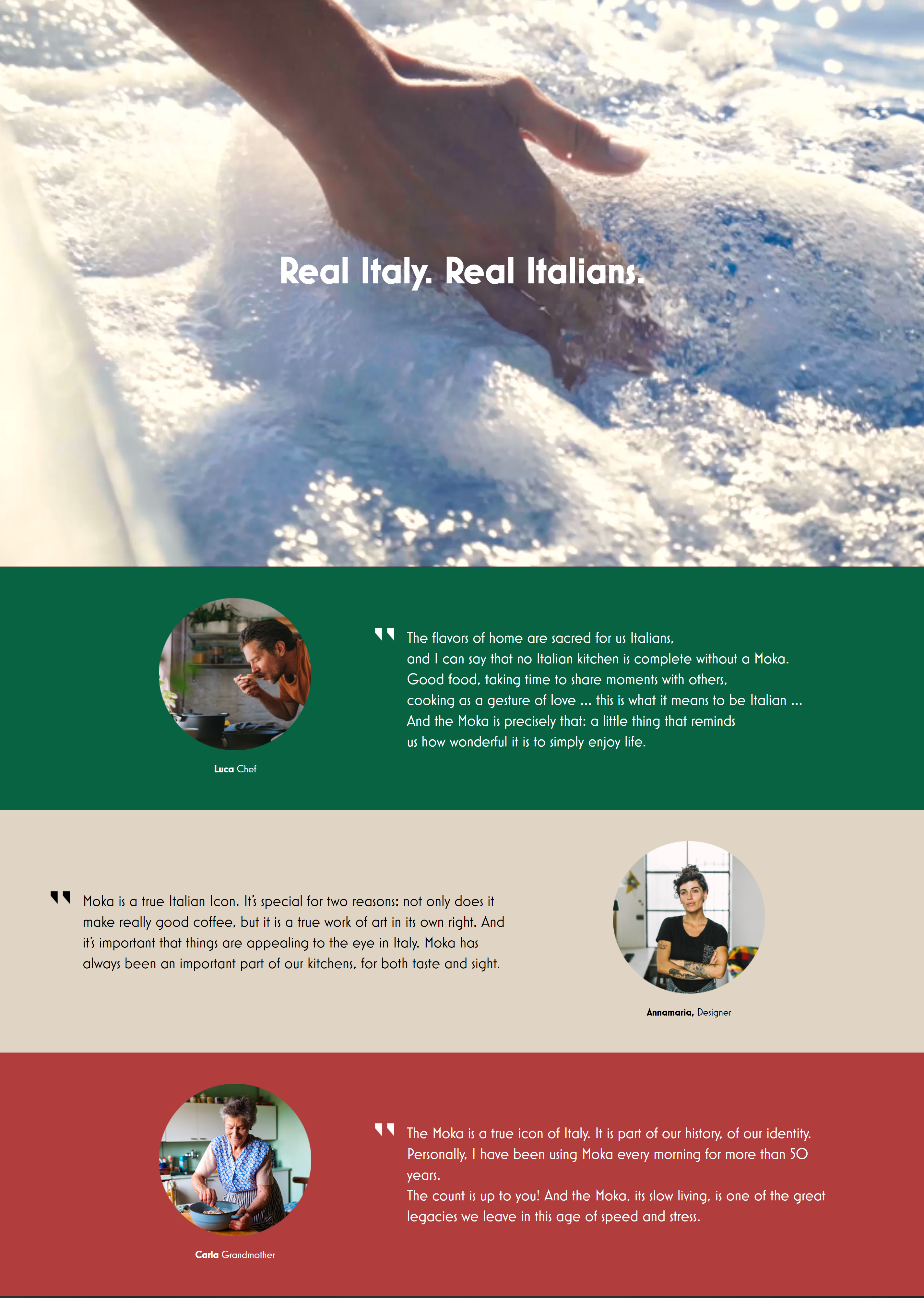 Bialetti is a great example that, if you want to have it all in your copywriting product history section - then you definitely can, if you do it right!
Conclusion
There are plenty of good examples of successful copy out there, but sometimes it’s good to zoom in on only a couple of them and analyze them in more detail. After all, getting lost amid the sea of online advertising and email marketing campaigns is easy.
I really hope these 3 selected ad campaigns and copy helped you out in your process of crafting the perfect copy for your business. Look at them as aces up your sleeve - anytime you’re short on inspiration; you can turn to them as sources of creativity.


